
Printed Long Pile Carpet Which One Is Good for Your Home
2026-09-20
You've fallen for the look of a printed long pile carpet—plush underfoot, rich in pattern—but now comes the harder question: which one is actually good for your home? A stunning photo won't tell you how the pile holds up in a busy hallway or whether the print fades after a year. That's exactly the gap Senseco fills with clear, practical guidance on choosing a carpet that looks great and lives well.
What to Look for in a Printed Long Pile Carpet Before You Buy
Printed long pile carpets can look stunning in photos, but the real test comes when you touch them. Run your fingers through the fibers and pay attention to density—thin patches often hide near edges or around intricate patterns. A quality piece will feel uniformly plush, with no sudden bare spots or loose threads that signal weak tufting. Also check the backing material; a sturdy woven or felted backing helps the carpet lie flat and resist curling over time.
The print itself matters more than many buyers expect. Look closely at how the design aligns with the pile direction. On cheaper prints, you might notice blurred lines or color bleeding where the pattern shifts. Gently brush the fibers in different directions to see if the image warps or becomes choppy. A well-made printed long pile carpet retains clear, crisp details even when ruffled, which tells you the dye was applied with care and won't fade oddly after a few months of use.
Finally, consider how the carpet will behave in your home, not just on a showroom floor. Long pile naturally traps dust and pet hair, but some printed versions use low-quality synthetic fibers that matt down quickly. Press your palm into the pile and release—it should spring back without leaving a deep handprint. If the fibers stay crushed or feel gritty, that's a sign of poor resilience or excessive shedding. Trust your hands as much as your eyes when making the final call.
The Real Difference Between Low Pile and Long Pile Prints
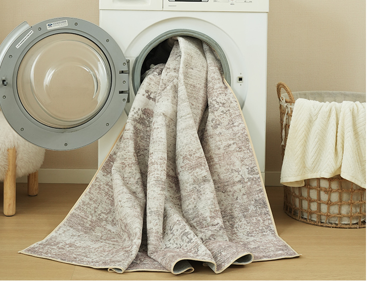
Most people assume the difference between low pile and long pile prints comes down to just the height of the fibers. That's part of it, but the real distinction shows up in how they handle light, touch, and wear over time. Low pile keeps things crisp — edges stay sharp, colors sit flat, and detailed line work doesn't get swallowed up. Long pile, on the other hand, introduces a soft halo around every shape, which can make bold graphics feel more tactile but can also blur fine details if you're not careful with contrast.
There's also a practical side that rarely gets mentioned: how these two finishes age. Low pile tends to hold its original look longer because the shorter fibers don't bend or crush as easily, so repeated folding or sitting don't leave obvious marks. Long pile has more room to move, which gives it that plush, almost velvety feel, but it also means high-traffic areas can start to show flattening or shading differences fairly quickly. If you're choosing between them for something that'll get handled a lot, low pile usually wins for longevity; if you want something that feels more like a statement piece and you don't mind a bit of patina, long pile has more character.
One more thing worth noting: the way ink sits on the surface changes the perceived depth. On low pile, the print feels embedded in the material — like it's part of the fabric itself. On long pile, the print tends to ride on top of the fibers, which gives it a slightly raised, dimensional look but also makes it more sensitive to directional brushing. Neither is better across the board; it comes down to whether you want a clean, graphic finish or a softer, more organic one that shifts depending on how the light hits it.
Rooms Where a Long Pile Printed Carpet Shines (and Where It Struggles)
A long pile printed carpet brings an almost theatrical softness to bedrooms and formal sitting areas. The extra fiber depth catches light in a way that makes patterns look slightly blurred, almost like a watercolor painting underfoot. That visual softness pairs well with low-traffic spaces where you want a sense of quiet indulgence, especially when layered over hardwood or paired with floor-length curtains.
Entryways, home offices, and dining areas tell a different story. Chair casters snag, crumbs bury themselves deep, and daily footfall mats down the pile until the printed design starts to look tired and uneven. Even a quick vacuum pass feels more like a wrestling match. If you insist on using one in these spots, a low-profile printed flatweave or a dense loop pile will hold its character far longer.
Stairs are perhaps the worst offender for long pile. The edges wear thin quickly, and the plush height can make each step feel unstable underfoot. On the flip side, a long pile printed carpet tucked under a reading nook or at the foot of a bed offers a soft landing that no other floor covering can match. The key is matching the pile height to how much the room actually gets used, not just how it looks in a photo.
Color and Pattern Ideas That Won't Overwhelm Your Space
When you want to introduce color and pattern without making a room feel busy, start with a single anchor piece. A muted terracotta throw draped over a neutral sofa or a small geometric print on a footstool can add personality while keeping the overall palette calm. The trick is to let that one element carry the visual weight, so the rest of the space can breathe.
For patterns, think about scale and repetition. A large, abstract motif on one wall or a set of curtains reads as intentional rather than chaotic, especially if the colors are drawn from the same family. Pair a bold stripe with solid linens, or mix a loose floral with woven textures to soften the contrast. Keeping the background tones consistent—like warm whites, soft grays, or sandy beiges—allows the pattern to stand out without shouting.
Finally, use color as a quiet accent rather than a dominating force. A row of dusty blue spines on a bookshelf, a single mustard chair tucked into a corner, or a collection of hand-thrown pottery in earthy greens can shift the mood entirely. These small doses are easy to swap out when your taste changes, and they prevent the room from feeling like a showroom. The goal is a space that feels layered and lived-in, not overwhelmed.
How to Keep a Shaggy Printed Carpet Looking New for Years
The biggest threat to a printed shag carpet is matting and crushing of the long fibers. Use a vacuum with an adjustable suction setting and no beater bar, or switch to a handheld attachment with a brushless head. Go over the surface slowly in multiple directions, and follow up with a wide-tooth carpet rake to lift the pile back up. This simple habit keeps the printed pattern crisp and prevents the shag from developing those flattened, greasy-looking trails.
Spills need attention within minutes, not hours. Blot liquids with a clean white cloth instead of rubbing, which pushes the stain deeper and twists the fibers. Mix a few drops of mild, dye-free liquid soap into cold water, dab the area gently, then rinse with a damp cloth and blot dry. For anything oily or sticky, sprinkle cornstarch or baking soda first to absorb the residue before you attempt any wet cleaning.
Once every few months, rotate the carpet 180 degrees so foot traffic and sunlight wear it evenly. If the rug sits near a window, draw sheer curtains or use a UV-blocking film to protect the printed dyes from fading. For a deeper refresh, shake the rug outdoors, then work a dry carpet shampoo powder into the fibers with a soft brush. Let it sit for the recommended time and vacuum thoroughly. Avoid steam cleaning or soaking the backing, as excess moisture can break down the latex and cause the printed layer to crack or peel.
Budget-Friendly Options That Still Feel Plush Underfoot
You don't need a huge budget to get that sink-your-toes-in feeling at home. High-pile polyester and microfiber rugs are the unsung heroes here—they look and feel like wool but cost a fraction of the price. I grabbed a 2-inch shag runner for the hallway last month, and every time I step on it barefoot, I'm surprised it was under $50. Neutral shades like oatmeal or warm gray tend to hide everyday wear while still giving the room a soft, expensive vibe.
Another overlooked trick is using plush bath mats outside the bathroom. A thick, memory-foam mat placed under a standing desk or in front of the kitchen sink adds instant comfort without the cost of a full area rug. They're small enough to swap out seasonally, and you can find ones with a cushioned backing that feels almost like a spa floor. I keep one by the back door, and it's become the spot where everyone pauses to wiggle their toes.
If you're patient, overstock sections and end-of-season sales are gold mines for soft flooring. Last winter I found a dense, velvety area rug for the bedroom marked down to $35—it was the last one in the store, but it's held up through daily vacuuming and two pets. The key is to touch everything before you buy: if it feels plush in your hand, it will feel even better underfoot, no matter the price tag.
FAQ
Look for a dense, low-profile long pile with a tight weave and a durable backing. Printed designs on polyester or polypropylene tend to resist matting better than cotton, but you'll still want a short pile height under half an inch for high traffic.
They can be, but choose a low-pile or medium-pile option with stain-resistant fibers. Avoid very shaggy styles where claws can snag, and check if the print is dyed through the fiber rather than surface-printed so it won't rub off quickly.
Tufted carpets have yarn loops or cut piles that create raised texture, while printed long pile carpets usually have a flat woven base with a high-density pile that gets a pattern applied on top. The print gives you bold designs without the cost of weaving multiple colors.
Yes, select a pattern with a lighter background or a smaller repeat. Soft, muted prints in cool tones tend to make a room feel larger, while very large, high-contrast motifs work better in spacious living areas.
Blot immediately with a dry cloth, then use a mixture of mild dish soap and cool water. Avoid scrubbing the printed surface. Test any cleaner on a hidden corner first, and always air dry flat, never rub the pile while it's wet.
Yes. The longer and softer the fibers, the more the print can look slightly blurred or faded because light hits the fibers at different angles. A medium pile with dense, upright fibers keeps the pattern crisper.
A non-slip latex or felt backing works best. If the carpet doesn't have one, use a separate rug pad made for hardwood floors. Avoid rubber backings that can trap moisture and damage the wood finish.
Not ideal under a table where chairs slide. Food crumbs and spills get trapped deep in the pile, and chair legs can crush the fibers. If you love the look, use a low-profile printed pile and place a clear mat under the dining set.
Conclusion
Finding the right printed long pile carpet comes down to how it's made, not just how it looks. Before buying, run your fingers through the fibers; a dense, tightly twisted pile resists matting and keeps the printed design crisp. Low pile prints tend to hold sharper edges and are easier to clean, while long pile versions trade some definition for a softer, cozier feel underfoot. If you want both, look for tufted or woven construction with a sturdy backing and a pattern that doesn't rely on tiny details. The best prints for deep pile are those with bold, blurred-friendly motifs—think watercolor blooms, abstract streaks, or oversized geometrics—because fine lines often get lost in the fluff.
Placement matters as much as the carpet itself. A long pile printed carpet shines in low-traffic rooms like bedrooms, reading nooks, or a formal living area where bare feet meet the floor. It tends to struggle in entryways, dining spaces, or hallways, where crumbs, pet hair, and constant foot traffic flatten the fibers quickly. To keep it looking fresh, vacuum weekly with the beater bar off and shake it outside every few months. Spot-clean spills immediately with a mild detergent, and rotate the rug a couple of times a year so fading and wear stay even. If you're on a budget, printed polypropylene or polyester versions can feel surprisingly plush, but check the pile weight—the higher the grams per square meter, the longer that cozy layer will hold up.
Contact Us
Contact Person: Ivy Yin
Email: [email protected]
Tel/WhatsApp: +86 18519681805
Website: https://www.sensecomarketing.com/